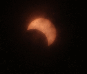
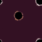
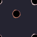
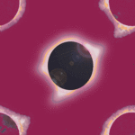
Our house in Nebraska was right along the path of the Solar Eclipse in August 2017. We were exactly along the line of the maximum and this meant we had a full minute of Eclipse magic. I designed these fabrics using colors sampled from photos of the eclipse and then riffed off of various impressions.To find my colors, I looked at dozens of images of this specific eclipse in local newspapers and at astronomy enthusiast posts on Instagram. Based on photos, similar to these, I found that the predominate hues captured were violets and burnt orange.
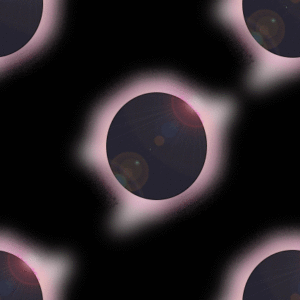
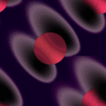
In order to create my fabric patterns, I did not just simply “adjust” any photo of the eclipse, but instead used flare filters and circles in Photoshop to build my own eclipse effect.
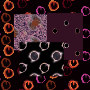
I riffed and then tried additional effects.
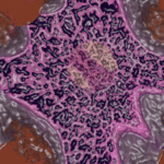
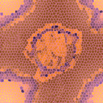
The goal was to create an endless repeat that would capture the mood of the solar event. I settled on five different styles of solar images, including one that looked like a pearl in a clam shell, one that looked like pansies, one resembling the photos I had seen and one with a rough but sinister feel with a muted maroon background.
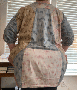
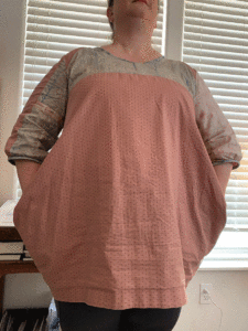
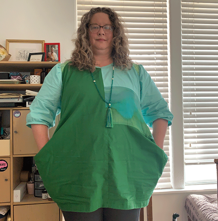
I ordered fabric from Spoonflower printed with these five favorite designs. I had one yard created of each of two fabrics and then two fat quarters and a 5×5 sample square created of the other three. I will post about the resulting shirt, including the applique work, tomorrow.